- Tomer's Newsletter
- Posts
- 🚪 Door = Main Image 🖼️
🚪 Door = Main Image 🖼️
🚪 Door = Main Image 🖼️
Hi ,
I’ve heard that the first step of dealing with addiction is admission - You’ve heard it here first - I’m addicted to doors.
Yes, you know, those things that have a handle, or without a handle, that you push on one side and pull on the other, or those that are revolving around and around, or the ones that you get close to and open automatically. Oh, the automatic doors, the fun I’ve had as a kid figuring out where to step to get the door opened. The power and control I felt were unmatched.
When you enter a home or a business, the door is your first impression.
What do doors look like online?
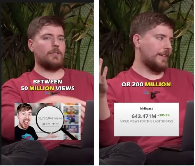
Take, for example, Mr. Beast is known for making eye-catching thumbnails. He’s said to have spent up to $10,000 on a single YouTube video thumbnail from time to time. Why? Because he can afford it? Yes! but that’s not the answer.

Well, based on what he says - Some videos improved from 50M views to 200M just because of the thumbnail. That 4x CTR just from that small change.
Now I’m not telling you to spend $10K on your main image, but the point is that a little bit of extra effort in the right place on your listing can and will pay dividends down the line. You’re main image should be a thump-stopper especially If you want a much higher CTR to purchase rate on your listing.
But let’s just experiment real quick with these two pics. Which one would you buy? Both these results pop up when searching for “Plastic Hangers 50 Pack”
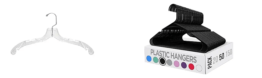
As boring as it is to shop for Plastic Hangers, someone out there is going to make a buying decision based on these images. Now swap your main image out with your competition and if your eyes don’t instantly dart over to your product then it’s time to update your images.
Your images need to be BETTER than the competition.
Your main image IS your door. It is the first thing your potential customer sees before entering your listing, before buying your product, and before they have any sort of experience with your company.
Well, this is obvious, right? Have packaging on the main image, with some text on it, showing the variations, quantities, etc. How about something less obvious?
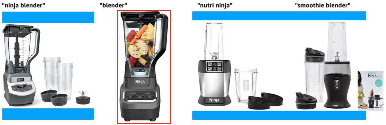
Look at these blenders in the image below. Why is the one marked in red longer than the others and takes more space? That one is not a square image. It’s a portrait image. What I’ve marked in blue is the space the one marked in red fills out, but the other blenders don’t.
Why is Amazon doing this?
Hint: It has something to do with scrolling on your phone.
Tomorrow, Wednesday, at 9am EST, I’ll be covering a workshop on the topic of image optimization. The workshop will be recorded and available the next day. There’s even a Q&A 2 weeks after the workshop.
The bad news?
It will be only available for my Top Dog Community members.
The good news?
You can still sign up, here: https://go.topdog.community
The bad news?
It might be a bit expensive for you..
The good news?
I got a 33% lifetime coupon! Here you go: TOPDOG33
Once a month in the community I’m doing a detailed workshop covering a single topic. Once you sign up, you also get access to the previous workshops. I’ve spoken on topics such as Variation expansion, product research, productivity, and more.
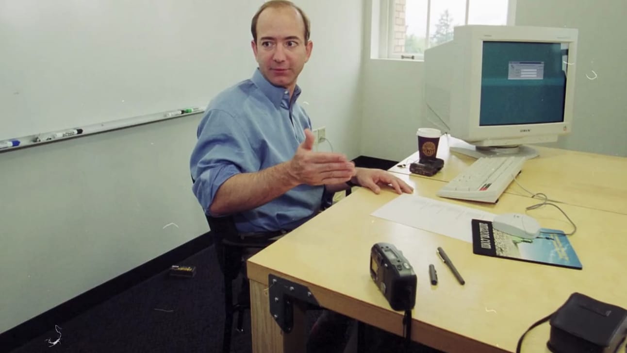
If you haven’t changed any of your images in a while and are not sure what that process should look like, I urge you to take action and sign up. Check out Jeff Bezos below, he is still using a door as a desk with some hinges to hold the legs in place.
The bad news?
It’s the end of this email.
The good news?
There’s another one coming your way next week.
Tomer